The navigation, search function, and layout of the dol.gov site make it difficult for the user to find what they are looking for. Numerous links to sub-agency sites creates confusion and frustration for users.
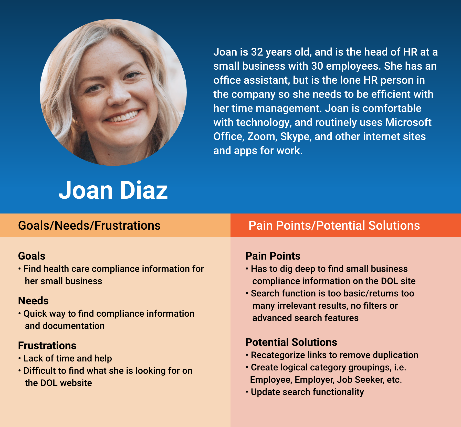
As an HR manager, Joan is a typical user of the dol.gov website. She frequently visits the site for information, documents, and compliance assistance for the small company she works for. She has a mid to high level of comfort/expertise with the web and technology, but has the dol.gov site to be difficult to use.
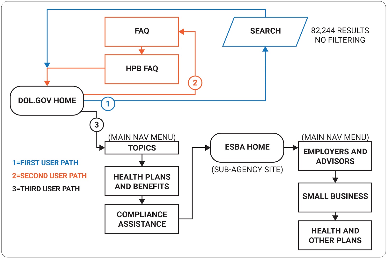
Joan visits the Department of Labor website to find various information, forms, and statistics that relate to her position as the HR manager for a small business. For this particular visit to dol.gov, Joan is looking for health care compliance information to ensure that her company is following the correct procedures and laws. It takes her 3 attempts across multiple sites to achieve her goal.
PDF contains in-depth analysis of user testing, including: 5 guerrilla user tests with screenshots, user flows, and insights.
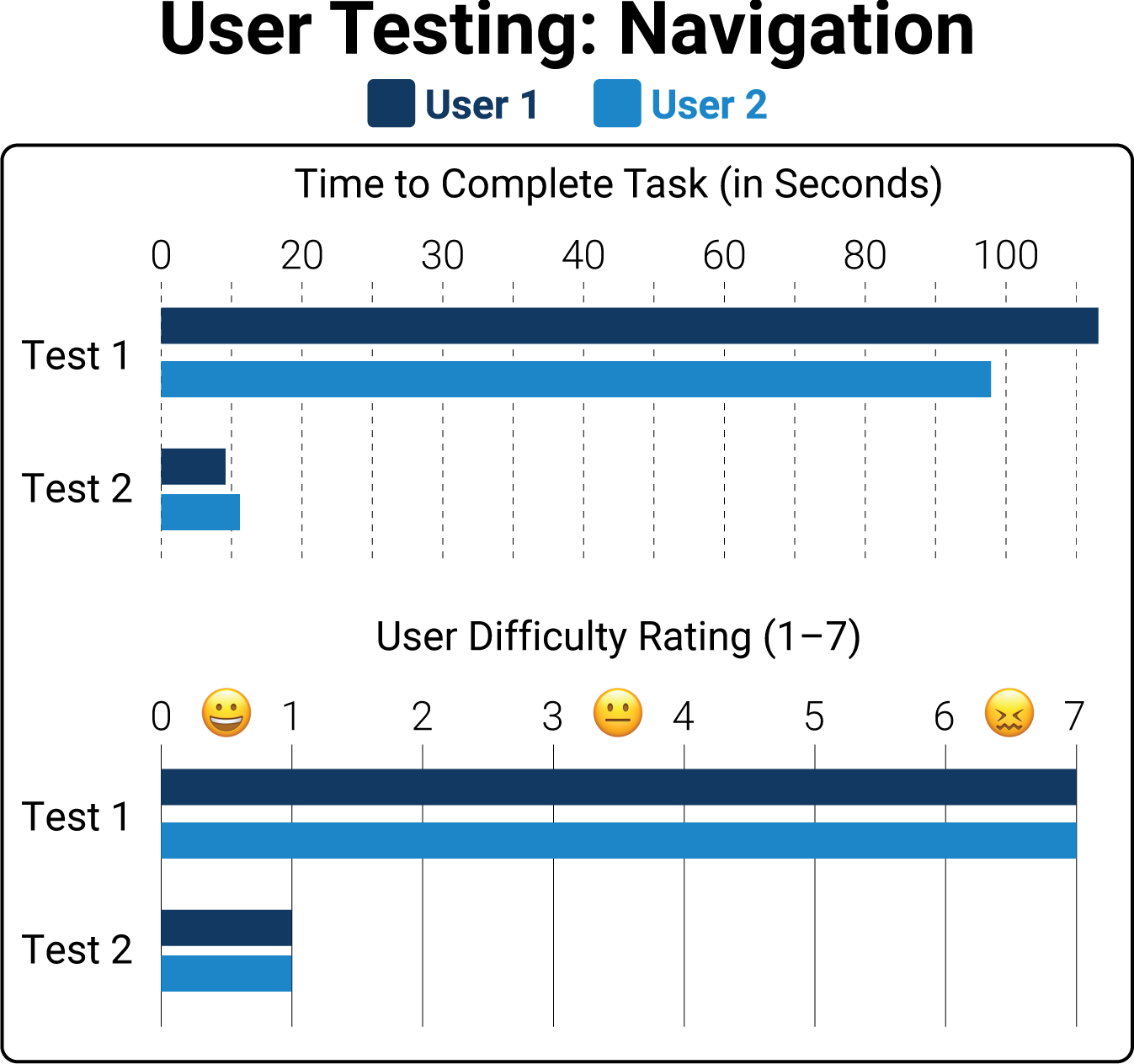
Two tasks from the “Top 20” list of most-visited pages were tested, to see how they are represented in the navigation. In the first test to find “Occupational Outlook Handbook”, which is the most-requested topic, users could not find this without using search — unless they happened to find the Top 20 link. The second test to find “Family and Medical Leave Act” only took an average of 10 seconds, with links found in Topics mega menu, as well as in the Quick Links.
While only testing two potential user paths, these tests revealed the difference in user experience based on how the navigation is designed. Someone on the design team for the dol.gov site has done the research to determine the most visited links on the site, but the current navigation does not guide the user to those links without a lot of digging. The redesign will address these and other issues.
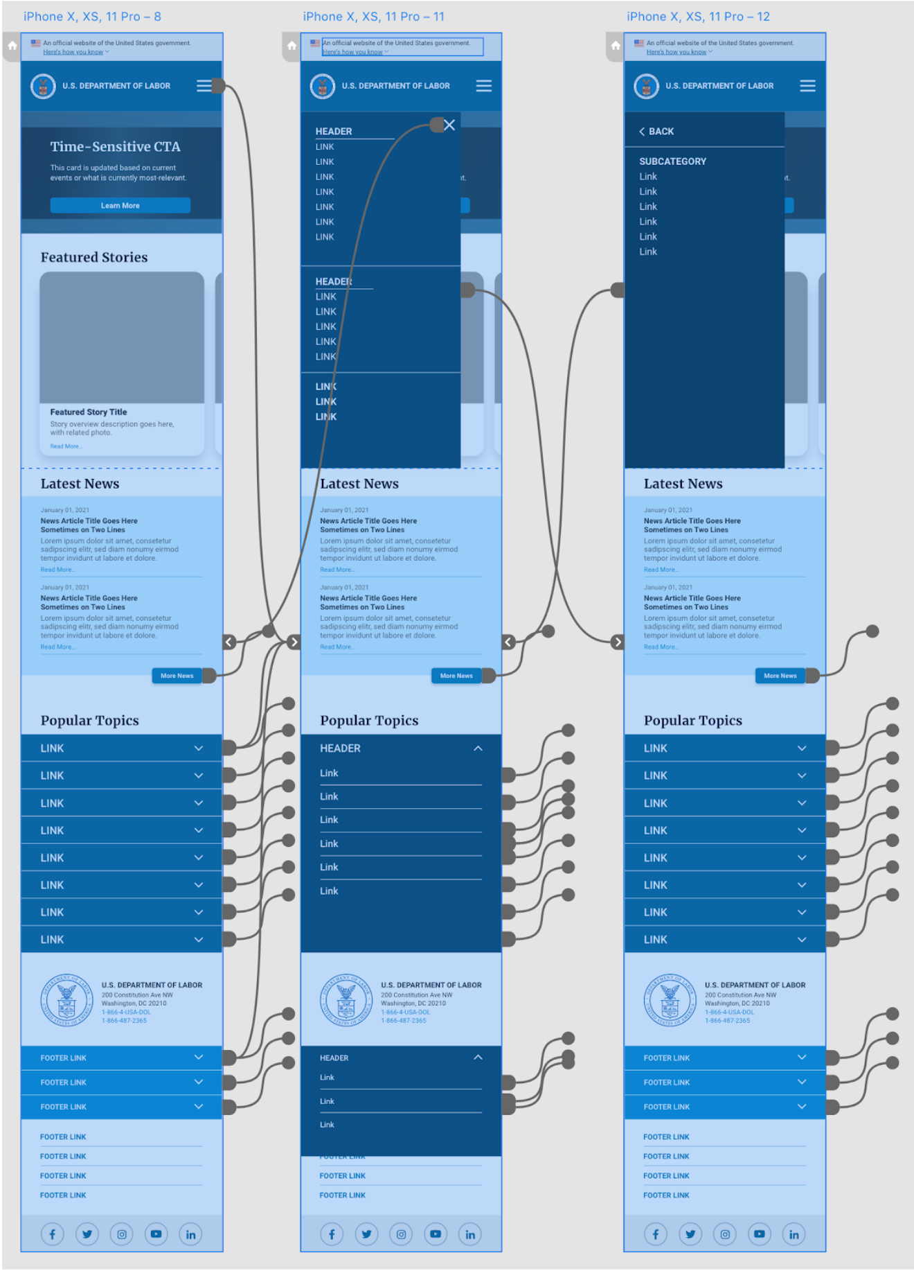
These issues are magnified on the mobile site, as the scrolling becomes unwieldy, and lack of content chunking into smaller bits makes navigation very challenging.
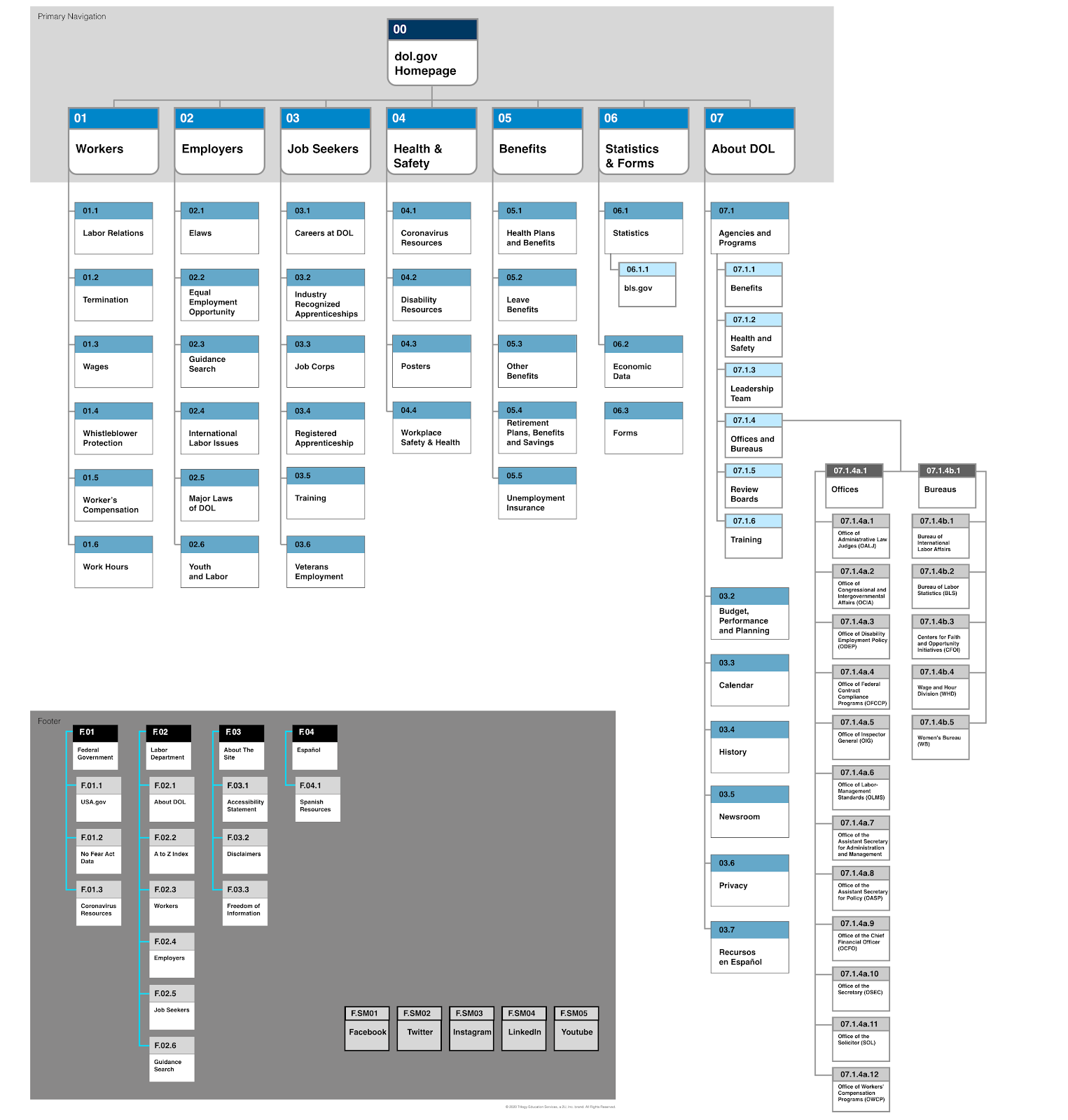
Links in the dropdown/mega menus, Quick Links, and footer were card sorted to create more useful content chunking and categorization. Topics and Agencies links in the original scheme produced drop down mega menus with dozens of links, only categorized by alphabetical order. To better guide different user sets to their relevant content, the following steps were taken:

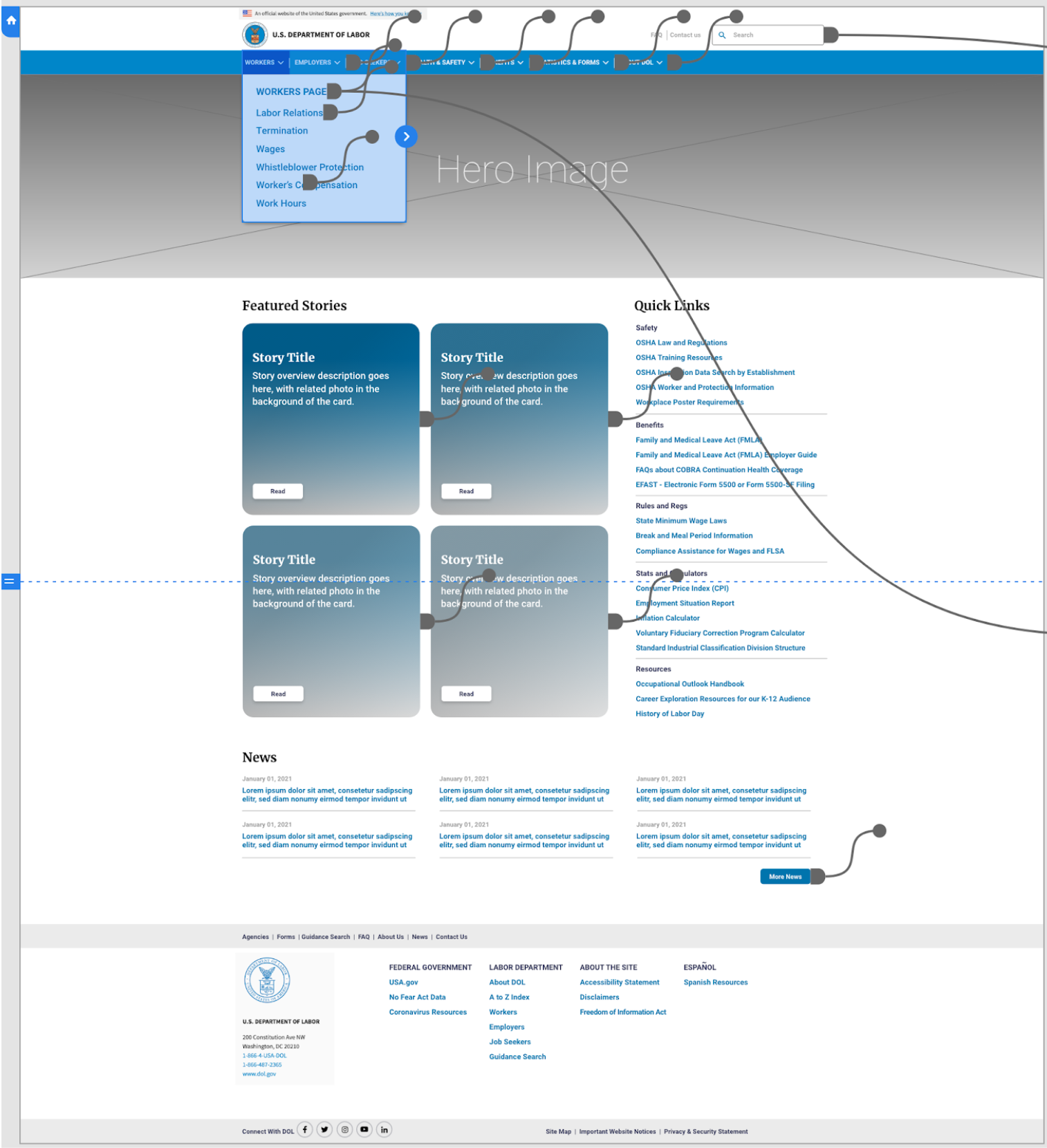
The site navigation was reorganized based on the content chunking from the card sorting exercise. The basic number of links is still the same, but they have been put into groups based on the different types of users who may be using the site: workers, employers, job seekers, researchers, etc . The user can find relevant topics quicker now with less drilling-down in the mega menus.
The footer was reorganized similarly. The Federal Government and About the Site columns were edited down to minimum required content. The Labor Department column was restructured to mirror the main navigation — with the three main user groups, and a general index.
The detailed site map breakout for “About DOL” is shown for stakeholders to see that previous content is still accounted for, but has been removed from the Primary Navigation and reorganized.
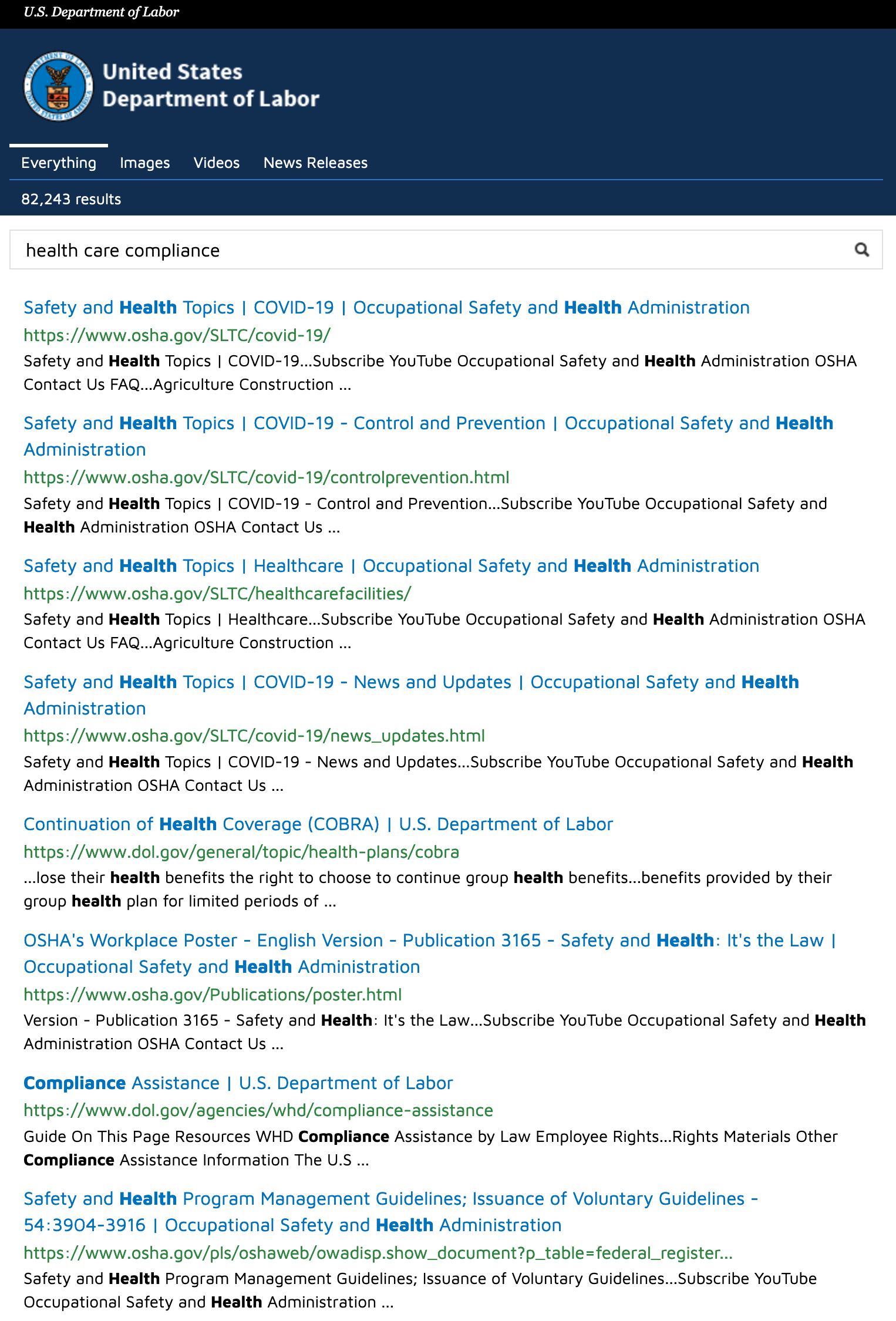
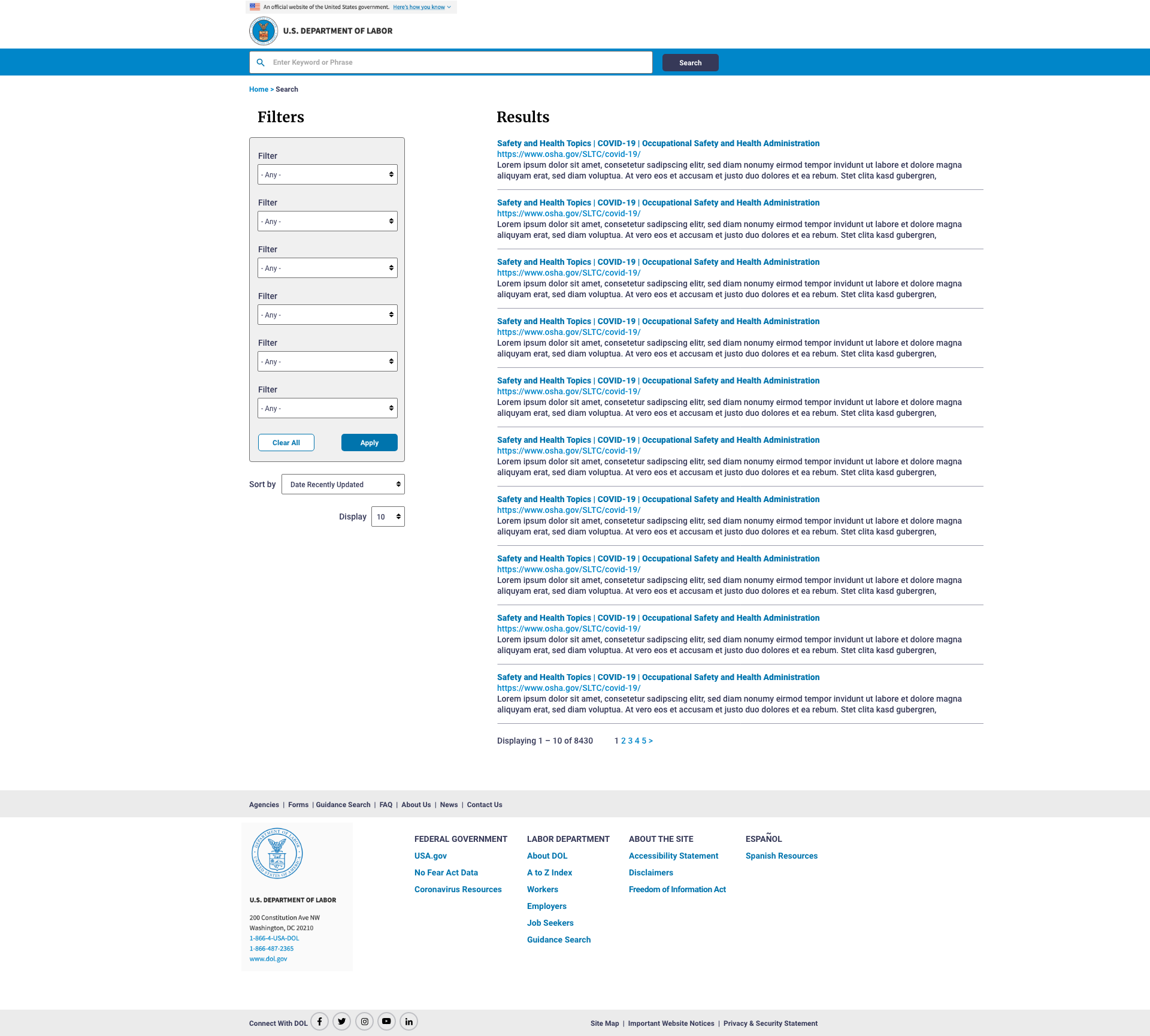
Previous dol.gov search function was a frustrating experience for users. There were no advanced search options or any filters. A search for “health care compliance” in a user test returned 82,243 results — with no way to filter. Even when working backwards from a specific page or article and entering those specific keywords into search, the results would not match. Essentially, the search function was not very functional at all.
The redesigned search is a dedicated page with multiple sorting and filtering options (final methods TBD) that will make this feature a functional tool for users, which is especially important on such a content-heavy site.
The site navigation was reorganized based on the content chunking from the card sorting exercise.
Main goals:
Navigation on secondary pages was reorganized similarly, with user groups as top-level differentiator.
Main goals:
Clickable Items for Testing:
Clickable Items for Testing:
Clickable Items for Testing:
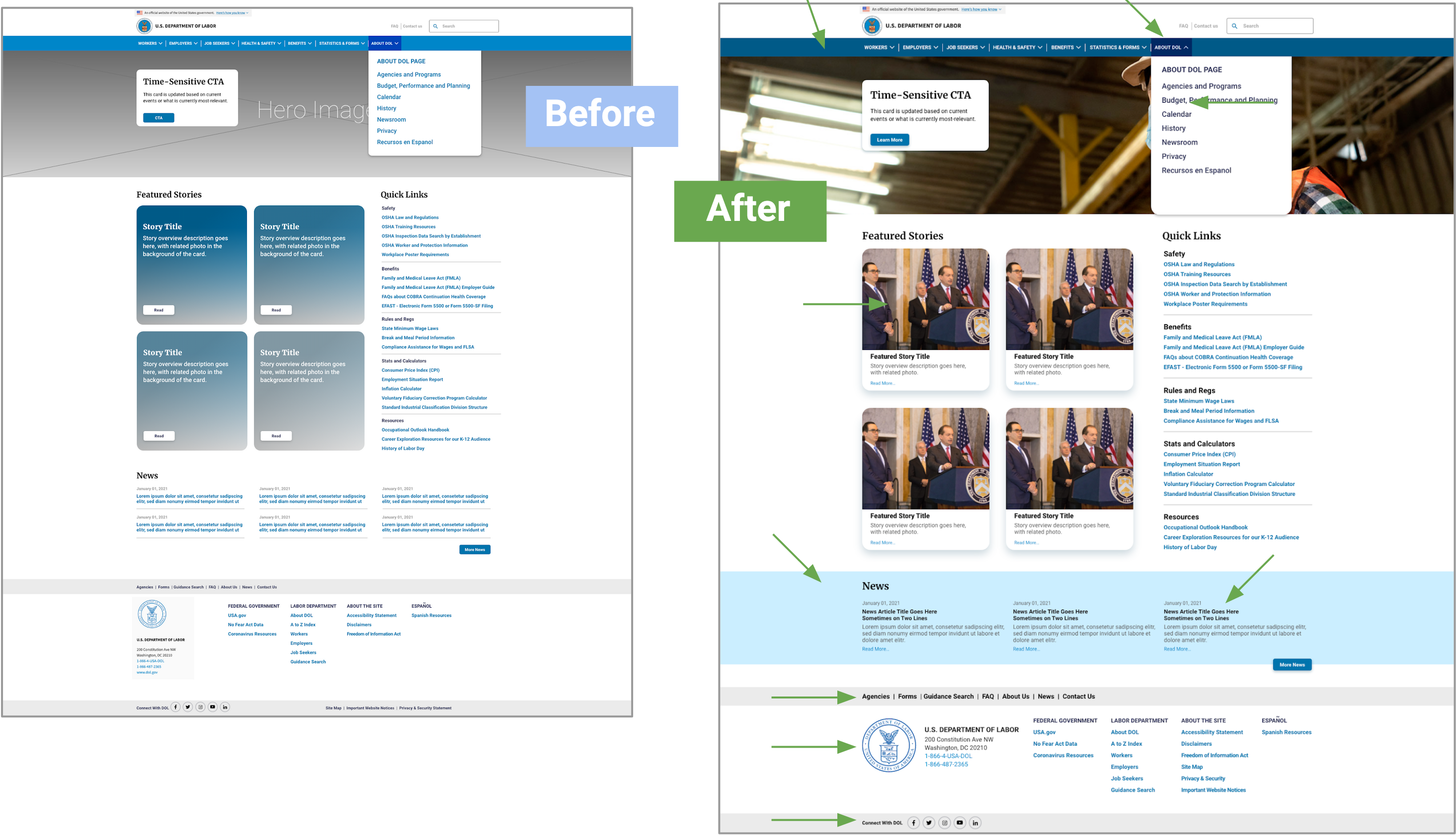
Navbar blue darkened, dropdown link text blue darkened for better contrast. Card layout simplified. News articles shown reduced to 3, light blue bar added behind to break up page and text better. Footer items edited
Style guide providing reference for: overall tone, typography, color, logo usage, buttons, images, UI patterns.
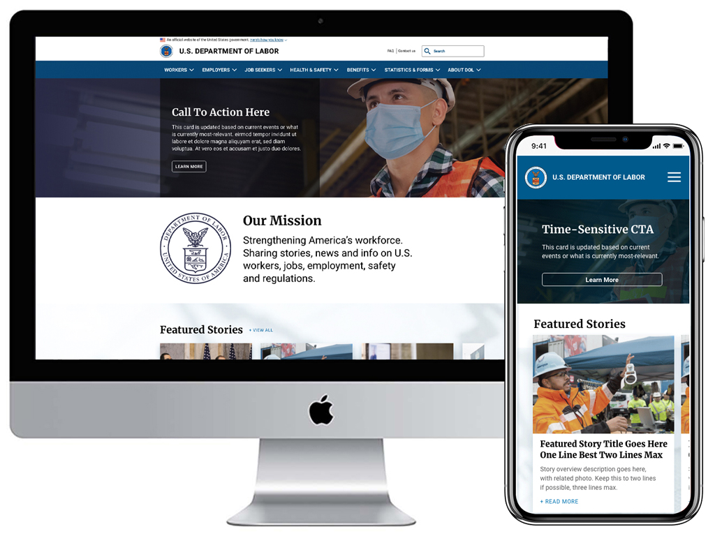
Final iterations of desktop version: homepage, secondary page, and search.

Final iterations of mobile version: home, slider menu, secondary, and search.


Using heuristics, and multiple user testing and iteration cycles, the Department of Labor desktop and mobile sites were redesigned to create a user experience that enabled users to navigate the site more effectively. Visual clutter was reduced, especially in regards to the numerous “floating” text links in the original version.
The streamlined navigation and content chunking of important topics and categories makes it easier for the user to find what they are looking for, and the addition of images and icons breaks up the monotony of the previous text-heavy site layouts.
The original search feature was unusable, returning tens of thousands of results with no way to filter or sort. The redesign added filters and sorting to make search a key feature and make navigation much easier.

